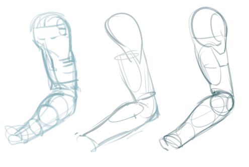
A simple list of key elements to remember about arms!
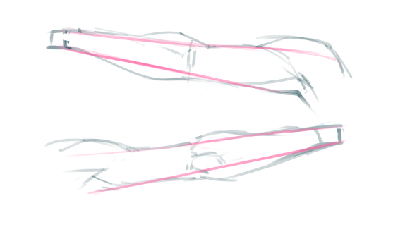
Arms tend to be a very simple shape with muscles woven in and out of it. Very often a simple tapered shape can be found in it. It’s good to keep this in mind so as to ensure the integrity of the arm and avoid wobbliness due to exaggeration of muscles and shapes. It’s also a decent way to simplify it.
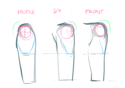
The shoulder has 3 prominent elements visible from almost every angle.
1) The ball of the shoulder (in pink) This shape is very important in defining the volume of the area.
2) The sharp edge (in green). Making the shoulder turn down too softly is a mistake unless your character has a lot of muscle mass. Consider the shoulder to be meat hung on a door knob, this visual helps reinforce a much strong corner shape then overly rounded shape.
3) The deltoid cuts off at nearly the middle of the upper arm. It is a mistake to make the shoulder too small, though it’s a pretty common occurrence with artist. The muscle must come down some ways to better pull the arm up otherwise it wouldn’t function properly.

I don’t know if I have the optimal way to draw the arm yet but keep in mind, the best way is your most reliable and consistent way. Less work and better results is always your best bet.
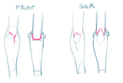
The forearm acts much like a hinge. It isn’t an exact representation but it helps to visualize it as a robots arm. The elbow joint and the muscles are simplified in this example and aren’t an accurate mechanical representation since the elbow slides over the joint and moves over a large rounded surface. Due to this there is a lot of subtle difference when the arm bends that needs to be observed since the elbow joint shifts shape dramatically.
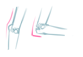
When the elbow bends it gains a very prominent shape that almost disappears when the arms is extended (straight). This is mostly due to the nature of the joint and how it slides around the pivot moving the prominent elbow bones severely.


